Using various indicators
Once you start looking for day trading strategies you encounter hundreds of indicators.
What are trading indicators?
Reward: +10 XP 0 0 0
You might already know a few:
- Moving averages
- RSI
- Volume indicators
- And many more.
You can also buy indicators from third parties like companies or other individuals. Before we dive into the details, you should know that you can become a successful day trader using only free indicators. 95% of all paid indicators are useless. They only cost you money. Also, most people use indicators the wrong way. Single indicators are no “ holy grail” that will give you information on when to buy or not. Indicators are used to make chart reading much easier. The real power of indicators is when you combine them.
Let’s dive into the details. The first thing that is very important to know is that you have various types of indicators. You should only use one or two max from each type ever. And you should never use indicators from one type only. A common mistake many traders make is using the wrong combination of indicators. The type of indicators are:
- Trend indicators
- Momentum indicators
- Volatility indicators
- Volume indicators
5.1 Trend indicators
Trend indicators use price to determine a trend. Trends can be bullish, bearish, consolidation or reversals (trend reversing the other way). Trend indicators are mostly lagging because they are using price averages but can also be leading. Leading indicators show real time information while lagging indicators always use old data.
5.1.1 Parabolic SAR
One example of a lagging trend indicator is the parabolic SAR, or parabolic stop and reverse. This indicator has three functions:
- Showing the current trend;
- Showing potential entry signals;
- Showing potential exit signals.
You can add the basic parabolic SAR in tradingview and it looks like this:

Source: Tradingview.com
The dots on the chart are the parabolic SAR. You can plot indicators in trading view by pressing the following button in the top of the screen:

If you type “parab” you’ll already see the trading view built in parabolic SAR. But you can also choose many variations other people make:

Source: Tradingview.com
You can even pick one that gives you alerts and everything. The parabolic SAR is displaying dots on the chart which mean the following:
- Buy when the dots are below the candles;
- Sell when the dots are above the candles;
- If the dots are below the candles this might indicate a bullish trend;
- If the dots are above the candles this might indicate a bearish trend.
5.1.2 Moving averages
Moving averages are lagging trend indicators. There are various kinds of moving averages:
- Simple moving average (SMA);
- Exponential moving average (EMA);
- Smoothed moving average (SMMA);
- Linear weighted moving average (LWMA).
The moving average looks at a certain period of time and it calculates the price average. The various types of averages are using various formulas. Don’t worry, you don’t have to memorize any formula. All moving averages are calculated automatically by basically every charting software you use. But it’s good to know how moving averages are actually calculated.
Simple moving average:
SMA is calculated by summing up the price closures of the selected period. The price is then divided by the selected period. For example, when using the 21 day moving average you sum up all the closing prices for each day and divide that by 21. The result is a line on the chart representing the average. Because it’s an average in the selected timeframe, the trend is always lagging.
Exponential moving average:
The EMA gives more weight to the latest closing prices by giving them more value in the equation. EMA is calculated by adding a certain percentage to the latest closing prices:
- EMA = (CLOSE (i) * P) + (EMA (i - 1) * (1 - P))
Where:
- CLOSE (i) = current period close price.
- EMA (i - 1) = value of the Moving Average of a preceding period.
- P = the percentage of using the price value.
Smoothed moving average
A smoothed moving average is an exponential moving average with a long lookback period. Older prices are reduced in weight but are never left out in the calculation. Unlike SMA and EMA where prices are removed when they are beyond the selected period. SMMA is a combination of the SMA and EMA. The main advantage is that it smooths out fluctuations in price.
Linear weighted moving average
The LWMA gives the latest price the highest weight and then lineary scales down with each price before that. The result is that the LWMA reacts quicker to changes in price than the SMA or EMA. The formula:
- LWMA = ((Pn∗W1)+(Pn−1∗W2)+(Pn−2∗W3)...) / ∑W
Where:
- P = Price for the period.
- n = The most recent period, n-1 is the prior period, and n-2 is two periods prior.
- W = The assigned weight to each period, with the highest weight going first and then descending linearly based on the number of periods being used.
Moving averages are widely used by many traders. Which moving average you need depends on your trading strategy. And remember, only use one type of moving average. Common practise is using a combination of multiple periods. For example, the EMA21, EMA50, EMA100 and EMA200. How does that look on a chart:
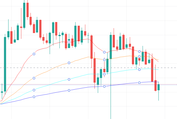
Source: Tradingview.com
The lowest (purple) line on the chart represents the EMA200 then following up the EMA100, EMA50 and EMA21.
You can use moving averages to determine a trend. The 200 moving average is mostly used as a baseline for determining the current trend:
- When the 200 moving average is moving up it is considered a bullish trend.
- When the 200 moving average is down it is considered a bearish trend.
- When moving averages are flatlined, there is no clear trend so you should look for market structure, consolidation or trend reversals. Depending on how you want to trade.
This is not set in stone. Most trading strategies use multiple moving averages each with different settings. While one strategy might use the EMA20, the other uses the SMA21. There can be hundreds of different variations. Moving averages can also be used as support and resistance. More often than not, prices will bounce on moving averages. As you can see in the example above, price tested the EMA200 and bounced back up.
5.1.3 Moving average convergence divergence (MACD)
MACD is a momentum indicator using two moving averages (trend indicators) of the price. The formula is quite simple:
- MACD = 12 EMA - 26 EMA
The result of the above calculation is the MACD line. A nine day EMA, also called the signal line, of the MACD is then plotted on the MACD line. When the MACD line crosses above the signal line it’s considered a buy signal. When it crosses below the signal line it’s considered a sell signal. The speed at how fast the crossover happens can also be an indication if the market is overbought or oversold.
What does overbought and oversold mean?
Reward: +10 XP 0 0 0
MACD can be used as a lagging trend indicator. MACD on the chart looks like this:

Source: Tradingview.com
The orange line represents the signal line and the blue line is the MACD. The green and red bars represent the MACD histogram. The histogram represents the difference between the nine day EMA (signal line) and MACD. The histogram turns positive (green) when the MACD is above the signal line and red when it’s below.
You should only use one or two trend indicators at the same time. There’s no point using the parabolic sar, EMA, SMA and MACD together because they all show the same thing. Stick to one depending on the strategy you are using.
5.2 Momentum indicators
Momentum indicators help you to determine the current momentum in price and spot reversals by looking at divergences.
What is a divergence in trading?
Reward: +10 XP 0 0 0
Momentum can give you an indication of how strong the current trend is. Let’s have a look at some widely used momentum indicators.
5.2.1 Relative strength index (RSI)
The RSI measures the magnitude of recent price changes to determine if the asset is overbought or oversold. As a reminder:
- Overbought means that the trading price is above its intrinsic value
- Oversold means that the trading price is below its intrinsic value
The RSI is measured on a scale between 0 and 100. Where from 30 till 0 is considered oversold and from 70 -100 is overbought. The RSI can be used in different ways. I like to use the RSI as a momentum indicator and not as an overbought or oversold indicator. I use the middle (50) as the baseline. When prices go above RSI 50 trend is bullish and can indicate long positions while below 50 it is considered bearish and can indicate short positions. Other traders use the 70 and 30 levels as overbought/oversold depending on the strategy. The RSI indicator looks like this:
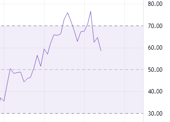
Source: Tradingview.com
You can see that the levels 30 and 70 are marked with a dotted line. If you want you can remove these lines.
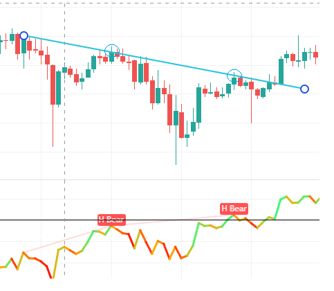
5.2.2 RSI divergence
RSI is not only used to determine momentum but can also spot reversals or continuations of the trend. A reversal means that the trend is going in the opposite direction. From bullish to bearish or from bearish to bullish. These reversals can be spotted by looking at the price and the direction of the RSI. The RSI is a leading indicator, meaning the signals are instant.
There are four types of divergences:
- Regular bullish divergence
- Regular bearish divergence
- Hidden bullish divergence
- Hidden bearish divergence
Regular bullish divergence
With a regular bullish divergence, the price is making lower highs but the oscillator (in this case the RSI) is making higher lows. A regular bullish divergence might indicate the end of the current trend. You’ll see regular bullish divergences mostly at the end of a downtrend. But that does not mean that every regular bullish divergence is a trend reversal.
- Price is making lower highs
- RSI is making higher lows
- Indicating bullish reversal (price might go up)

Source: Tradingview.com
Regular bearish divergence
With a regular bearish divergence the price is making higher highs but the oscillator (in this case the RSI) is making lower highs. This might indicate the end of an uptrend.
- Price is making higher highs
- RSI is making lower highs
- Indicating bearish reversal
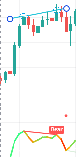
Source: Tradingview.com
Hidden bullish divergence
With a hidden bullish divergence, the price is making a higher low while the RSI is making a lower low. This might indicate bullish trend continuation.
- Price is making higher lows
- RSI is making lower lows
- Indicating bullish continuation
Source: Tradingview.com
As you have noticed, you can have multiple divergences in a row.
Hidden bearish divergence
With a hidden bearish divergence, price is making lower highs but RSI is making higher highs. This might indicate bearish trend continuation.
- Price is making lower highs
- RSI making higher highs
- Indicating bearish continuation
Source: Tradingview.com
You can find many cheatsheets of RSI divergences online. Search for "RSI divergence overview" and you'll find a lot of examples. You can print these to learn the various types of divergences.
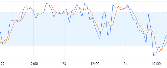
5.2.2. Stochastic oscillator
The stochastic oscillator is a momentum indicator comparing a certain price to multiple prices ranging over time. It is used to determine overbought and oversold areas much like the RSI. The stochastic oscillator also works with a range of 0 - 100. Everything above 80 is considered overbought and below 20 oversold. The stochastic oscillator consists of two lines named K and D. K compares the highest high and lowest low on the selected price range. It displays the last closing price as a percentage of this range. The D line is a moving average of the K line. When these lines cross it might indicate a reversal. How does this look on the charts:
Source: Tradingview.com
K is the blue line and D the orange line. Keep in mind to only use one momentum indicator at the same time. It’s not recommended to use the RSI and Stoch at the same time since they display the same information.
To make things even more complicated, there is also a stochastic RSI indicator. This indicator combines the stochastic formula with certain aspects of the RSI indicator. It also ranges from 0 -100. And just like the other two indicators, the stochRSI is also used to indicate overbought and oversold areas. If you want more information about the stochRSI check out investopedia. How does the StochRSI look on the chart:

Source: Tradingview.com
The stochRSI is more volatile than the stoch and RSI, generating more noise. It also creates more overbought and oversold areas. Due to this the stochRSI is not very reliable. But you can disable the K line and only use the D line to spot divergences. Just like with all indicators, you can use them in various ways. But you should not use the stochRSI, RSI and MACD together on the same chart.
5.2.3. Commodity channel index (CCI)
The commodity channel index measures the difference between the actual price and the historical average price. Just like the RSI and Stochastic Oscillator, the CCI also looks for overbought and oversold areas. It’s used for spotting weak trend and trend reversals by looking at divergences. The CCI does not range from 0 - 100 but is unbound, meaning it can go much higher or lower. In general, when the CCI moves from 0 to over 100 it might indicate a new uptrend is starting. When it goes from 0 to minus 100 it might indicate a downtrend is starting. How high or low the CCI can drop depends on the asset you are trading.
Another way to use the CCI is spotting divergences. For example, when the price is rising but the CCI is falling that might indicate a weak trend. It can be used as a lagging or leading indicator.

Source: Tradingview.com
5.3. Volatility indicators
Volatility indicators measure the movement in price either up or down. Most of the time this is based on historical prices. These indicators help traders to find information about buying and selling ranges by looking at the volatility.
What is volatility?
Reward: +10 XP 0 0 0
The crypto market as a whole is a prime example of very volatile markets.
5.3.1 Bollinger bands
The bollinger bands are a very popular and much used indicator. The bollinger bands consist of three lines. The middle line is based on an SMA (simple moving average). The SMA is used as a baseline for the other two lines that are called the upper and lower band. The upper and lower bands are used to measure volatility by observing the relationship between the bands and the price. It measures the relative high or lows compared to previous trades. When prices increase, the bands will expand and will narrow down when prices decrease.
Bollinger bands can be used to spot reversals. The BB are mostly used to determine how hard an asset is falling in price. In a downtrend, the price tends to follow the lower band. If the price does not touch the lowerband or seems to move away that might indicate a trend reversal. You can adjust the parameters of the bands and the MA to line up with your strategy.

Source: Tradingview
5.3.2 Standard deviation
Standard deviation measures the volatility of price by relating a price range to a moving average. The higher the number on the indicator, the wider the spread between the current price and the moving average. This indicates much volatility. You can use this indicator as follows:
- If the value is low, that indicates the market is stable and something might happen in the near future
- If the value is very high, this might indicate that the trend might be reversing
Markets are less volatile in an uptrend where in a downtrend there are many panic sellers causing much more volatility.
Source: Tradingview.com
5.3.3. Average true range
Average true range measures market volatility by decomposing a range of price for the selected period. Typically, the ATR calculation is measured over a 14 day moving average. For long term volatility you can use larger periods. Normally, the range is measured by subtracting the bars low from the high. But the downside is that normal range can’t check volatility between bars individually. This is the case when there are gaps in the chart. For example, when the price closes at a certain price on friday and when the market opens again on monday the price might be way higher or lower. Meaning there is a gap between the opening and closing candles. While normal range can’t take these situations into account, true range can.
To calculate the ATR you need to know:
- The current bar’s high
- The current bar’s low
- The previous bar’s low
The ATR is the greatest distance you can find between these three variables (prices). This can be:
- High minus low (also known as the normal range)
- Previous close minus low
- High minus previous close
A low ATR value indicates periods with smaller ranges mostly found in consolidation periods which means low volatility. While an expanding ATR indicates volatility while each candle is getting larger. When price is reversing and there is an increase in ATR this might indicate that there is much strength behind the move. Higher ATR values are mostly formed by huge moves in price (either up or down) and are most likely not sustainable. Traders can use this as a signal to get in a position.
Some traders also use the ATR for (trailing) stop loss placement. A rule of thumb is two times the ATR.

Source: Tradingview.com
Here we plotted the “ATR Stop” indicator on the chart. You can use the ATR line for stop loss placement if this fits your strategy. Using this indicator, you can determine the inputs of the Normalized Average True Range (NATR). NATR is displayed as a percentage rather than absolute price compared to ATR. Meaning you can’t compare ATR between securities because it’s derived from the absolute price where NATR is a percentage of the stock price. This way you can compare between securities.
5.4. Volume indicators
What is volume in trading?
Reward: +10 XP 0 0 0
5.4.1. On balance volume (OBV)
OBV is a leading indicator that measures buying and selling volume. When a candle closes higher than the previous high it is considered up-volume. When a candle closes lower than the previous close it is considered down-volume. OBV looks like this on the chart:

Source: Tradingview.com
What the line represents is actually not that important. The most important thing is that you can spot divergences:
- When the price and OBV are making higher highs and higher lows, the upward trend will most likely continue.
- When the price and OBV are making lower highs and lower lows, the downward will most likely continue.
- During consolidation, when the OBV is rising, the price may break out upwards.
- During consolidation, when the OBV is falling, the price may break out downwards.
- When price continues to make higher highs and OBV fails to make higher highs, the upward trend might reverse.
- When price continues to make lower highs and OBV fails to make lower highs, the downward trend might reverse.
It's basically RSI divergences. Just replace the RSI with OBV.
5.4.2. Volume Weighted Average Price (VWAP)
VWAP is used to measure the average closing prices weighted by volume. Because it’s using previous prices and volume it’s a lagging indicator. You can use VWAP as a support and resistance zone (in confluence with other indicators). Prices tend to bounce on VWAP quite often. Few examples:

Bitcoin chart five minute frame time, source: Tradingview.com
Just like using moving averages: when prices are above VWAP, the trend is up. When prices are down VWAP, the trend is down. In the above example the price goes down the VWAP line (yellow arrow). This might be an indication of a downtrend. If you can line up the VWAP with additional indicators like a moving average and the RSI this can be a very powerful setup. But some traders use VWAP the other way around because many traders think that VWAP is used by institutional investors as well. It creates a psychological aspect like I mentioned in the beginning of this guide. Once everyone is using the same indicator the same way it becomes a self fulfilling prophecy. So if you know how other traders are using VWAP you can counter these trades.
VWAP also has upper and lower bands just like the bollinger bands. The upperband acts as an overbought level and the lower band as an undersold level. You can also use these bands for your trading strategy. I like to use only VWAP in confluence with other indicators showing me a down or uptrend and support/resistance levels.
5.4.3. Volume rate of change (VROC)
VROC measures the percentage of change in the current volume compared to previous volumes in the selected period. It uses a 14 period average but can be adjusted. It can be used as a trend indicator and you can also detect divergences. How does it look on the chart:

Source: Tradingview.com
This is a VROC indicator created by the tradingview community. The standard VROC is not available as a built-in indicator it seems. But that does not matter because the above example is showing the exact same thing only in a more fashionable way.
VROC can be used to determine a rise or fall in volatility. But be aware that although volume might be very high, you can’t always see this in the price action. Because if the buyers and sellers are equally represented the price will hardly move. VROC can also spot fake breakouts in the market. For example, when price is surging, volume and volatility tends to go up. But when the market reaches new highs but the volume is very low that might be a good indication that it will not push further and price might drop.
I discussed twelve different indicators (three of each four types) you can use.
What are the four types of indicators?
Reward: +10 XP 0 0 0
You don’t have to remember all this information. Because most likely you’ll never use them all at the same time. Just be aware that there are four types of indicators. If you find any strategy that is using the same type of indicators that might be a signal something is wrong. It does not make sense to use multiple indicators that are telling you the same thing.
As a beginning day trader, you’ll probably need to read multiple articles or watch multiple videos about the indicators you want to use. That’s because all indicators can be used in many different ways. The explanations above are basic but not set in stone. This totally depends on the strategy you want to use and how that particular strategy is using the indicators.
5.5 Candlestick patterns
Candlestick patterns are very popular and widely used among many trading strategies. Candlesticks can give you much information about direction, trend and sentiment in the market. If you don’t know how to read candlestick you should read my in depth article first: Reading candlesticks for beginners.
Candlestick patterns are based on visuals. There are no calculations performed like the other technical indicators I discussed. There are many different candlestick patterns. I will list a few. If you want to find more you can just google “candlestick patterns”.
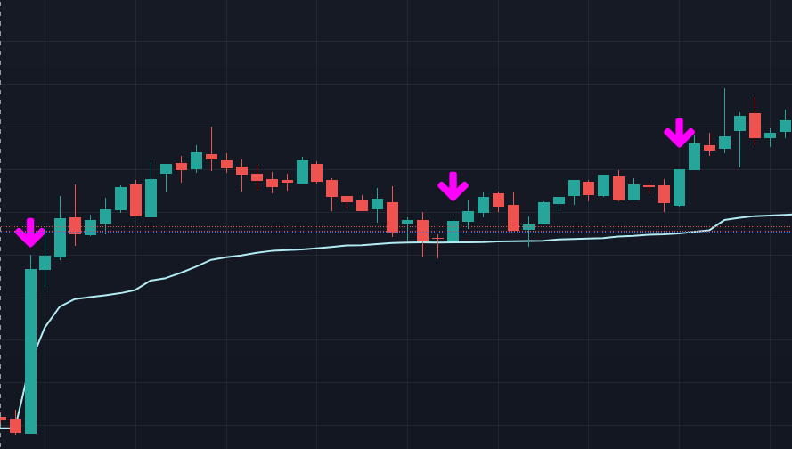
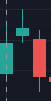
5.5.1. Engulfing candles
An engulfing candle is a candle (either red or green) that “eats” the entire body of the previous candle. Few examples:


Source: Tradingview.com
In each example the right candlestick body is “eating” (engulfing) the left candlestick. This is called an engulfing candle. You can have two kinds of engulfing candles:
- Bullish engulfing candle;
- Bearish engulfing candle.
As you might have guessed, a bullish engulfing candle is formed when the new candle is green and fully engulfs the previous red candle. And the other way around with a bearish engulfing candle (red “eating” green).
This can be used as an indication of a trend reversal or continuation. For example:
Source: Tradingview.com
The first engulfing candle was huge. Price consolidated a bit. Then it bounced on the VWAP with an engulfing green candle. And we see another engulfing candle forming after that. This does not mean you should trade every engulfing candle, only when it lines up with other indicators or patterns. Another example of trend reversal engulfing candles:

Bitcoin chart five minute frame time, source: Tradingview.com
In this example we have two huge engulfing green candles in a row coming from a downtrend. This means that buyers have taken over and the price might start going upwards. After the first engulfing candle, the price went down to test the last low again but after the second engulfing candle the buyers took over and the price went up.
Some traders also count the wick before they are classified as engulfing and others only use the body. Trading only based on this pattern alone is probably not a good idea. Always use candlestick patterns with other confluences.
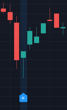
5.5.2 3 line strike
The 3 line strike consist of four candles while three of them go in one direction and the fourth candle is an engulfing candle in the opposite direction:

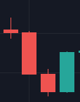
Source: Tradingview.com
The 3 line strike is considered a trend continuation single. Meaning the trend is most likely to stay in the same direction (either up or down). Before you use 3 line strikes you first need to know what the current market structure is. Is the market (trend) going up or down? Once you established a clear trend you can look for 3 line strikes:

Source: Tradingview.com
In this case, there is a clear downtrend. Only look for bearish 3 line strikes in a downtrend and bullish 3 line strikes in an uptrend.
They can also be found in an already established up or down trend and acts as a strong signal of trend continuation. For example, when multiple 3 line strikes happen in a short time frame:

Source: Tradingview.com
Because the trend is already up (yellow line and price above VWAP), a 3 line strike with a retest on the VWAP might be a good indication price will continue up. The second 3 line strike is not that confident. Actually, this particular up trend ended with a 3 line strike reversal:
Source: Tradingview.com
Price closed below the trend line, the following candles were not recovering and heading down. Market structure was broken. This 3 line strike was a good indication of trend reversal while the first 3 line strike was a signal of continuation.
You should not solely rely on this pattern alone and should always be used in confluence with other indicators or patterns. There are some indicators out there that have the 3 line strike built in so you don’t have to look for them on the charts. Search in tradingview or other charting software for 3 line strike.
To recap:
- 3 line strike and engulfing candles show possible trend reversal when they occur at the end of the trend
- They show possible trend continuation when they are forming within an established trend.
If you go back to the engulfing candle example, can you spot the 3 line strike?
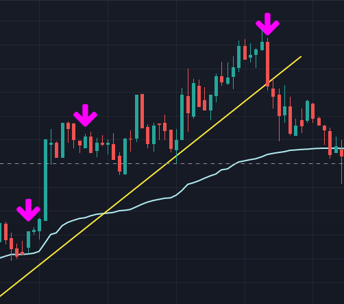
5.5.3. Morning star
The morning star is a trend reversal pattern. It looks as follows:

Source: Tradingview.com
Note that the “MS” message is from tradingview indicating it found a morning star pattern. The morning star consists of three candles in a particular pattern. It is mostly found at the bottom of a trend:
Source: Tradingview.com
The opposite of the morning star is called the evening star:
Not every morning or evening star will indicate a reversal. Always look for other confluences. You can find indicators in tradingview that mark morning and evening stars for you. But keep in mind this will use up one indicator spot and since you only have three with a free account, make sure you only use the indicators that fit your strategy.
5.5.4. Hammer Stick pattern
Last but not least, the hammer stick pattern. They are mostly found in a down trend and are shaped as a (surprise..) hammer:
Source: Tradingview.com
The wick should be at least twice as long as the body. The hammer represents a push down (the wick) but buyers then take over and form the hammer. This might indicate a trend reversal. Hammer sticks are pretty rare.
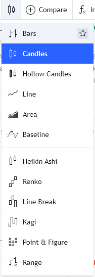
5.5.6 Different candle sticks
There are actually different types of candle sticks. We talked about candle sticks a lot but you can use multiple variants of candle sticks. In Tradingview you have:
Bars:

Source: Tradingview.com
Heikin Ashi:
Source: Tradingview.com
Renko:

Source: Tradingview.com
Kagi:

Source: Tradingview.com
While the standard candle sticks are probably used by most traders, heikin ashi is also used a lot. Hekin ashi candles are calculated based on an average of the opening and closing price, highest and lowest price. They also always open in the middle of the candle. Resulting in different patterns. While it’s beyond the scope of this guide, there are many trading strategies out there that use heikin ashi candles. To plot different candles on the chart in tradingview, click the candlesticks in the top of the screen and select the candle you want:
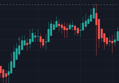
5.6 Wave patterns
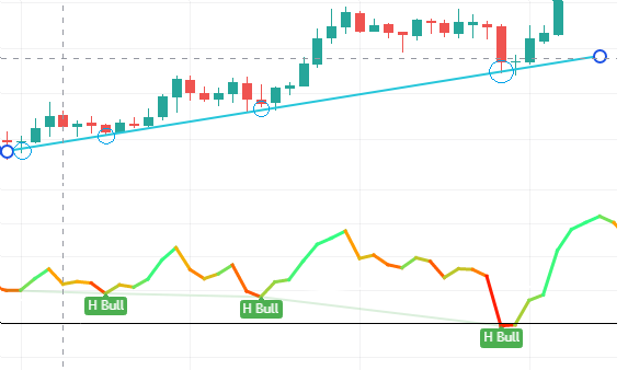
Wave patterns trading is based around the Elliott Wave principle. Elliott discovered underlying social principles and developed a tool around this in the 1930’s. He proposed that markets will follow certain patterns. Many traders still use Elliot waves to this day in combination with the fibonacci sequence (we will look at fibonacci in the next chapter). Elliot did not actually know his wave patterns were following the fibonacci sequence quite closely. Here you can find an overview of the most commonly used Elliot waves and their characteristics.
Let’s look at an example:

Bitcoin chart. Source: Tradingview.com
Once you see a pattern in the candle sticks, you can draw lines between certain price points. Most of the time these price points are based on the lowest lows and highest highs. As you can see in the example above, the next top of the chart is always a bit higher than the top before it. And the lowest lows are always a bit higher than the lows before. If you draw two lines between those points, you can draw a wedge. Now the tricky part is drawing the lines correctly.
Once the candle stick breaks out of the pattern (either up or down) it could mean there is a good trading opportunity. Once it breaks out the top blue line, it could mean bitcoin broke out the pattern and will move up. Once it breaks the lower blue line, it could mean bitcoin will go down. You’ll never know in advance if it will break through the wave moving up or break through down below. But there are some statistical chances of certain patterns having a particular outcome. For example, the statistical chance of an ending diagonal wave breaking out below the 5th touch point is higher than the chance of breaking out on top. A theoretical example:
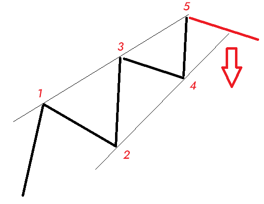
You can only use this wave if there are five clear touchpoints and you should only trade based on the fifth touch point. See more examples here: Elliot Wave Patterns overview
A real life example:

Source: Tradingview.com
Here are some examples of wave patterns. The first one is a classic ending diagonal. As you can see, after the fifth touchpoint bitcoin broke the uptrend and fell below the lower blue line. Also note it actually did this two times. When we zoom in a little bit:

Source: Tradingview.com
You can see the first wick of the candle breaking the blue line and shooting back up again. A few days later it broke the blue line again. It almost came back again but a few weeks later a clear downtrend began. This was caused by news about Tesla selling Bitcoin. In this case, if traders are using wave patterns to trade they will know that the fifth touchpoint is important. Because, statistically there is a bigger chance that the price will drop. That does not mean it will always happen. If you know this then you can build your trade around this principle. What could you do in this case?
If you know the chances of breaking the pattern in a downtrend means you can go short. Taking a short position means that you are expecting that the price will drop. When you go short, you lend the asset from someone else (the lender). If you are correct and prices drop you will buy the asset for the lower price and return the borrowed assets to the lender. The difference in price is your profit. For example:
- Bitcoin is $10.000 and you decide to go short.
- You "borrow" 1 BTC from your broker and your broker directly sells it for the current market price (in this case $10.000).*
- You have the obligation to pay the broker back 1 BTC (note, this does not mean you owe $10.000).
- Bitcoin drops to $8500 and you decide to sell the short position.
- You can now buy 1 BTC back for $8500 and return it to the broker.
- $10.000 - $8500 = $1500 in profit (minus fees).
* You don't always borrow from your broker. On some platforms you actually borrow from other random people.
But if you are wrong and the price goes above $10.000 it will cost you money. That is where stop losses come into play. With stop losses you can stop your losses by pulling on the break and selling your position before hell breaks loose. Almost every professional trader uses stop losses. Without the proper use of stop losses your risk vs reward ratio is doomed.
Let's have a look at the above example and how you could setup this trade:

Source: Tradingview.com
- You already know that there is a statistically higher change that the trend will break the lower blue line. Based on the Elliott Wave principle.
- Because price will most likely go down, you know you have to go short.
- Now you have to determine when you are wrong and set your stop loss at that exact point.
The last point is important because this will determine the place of the stop loss. When you know the price might go down below the lower blue line, you have to set your stop loss above the blue line. Because if the trend does not break the blue line, a downtrend will most likely not happen yet and your prediction of the price breaking the wave is false. So basically you have to ask yourself:
“At what point do I think that I'm wrong? At what price point do I almost certainly know that it will not follow the wave pattern?"
You would certainly know that the price won’t reverse when the price goes above the upper blue line. So you have to place your stop loss somewhere between the blue line (red lines):

Source: Tradingview.com
You could place your stop loss around the mark of the red arrow. But if price goes all the way back up to the red arrow it’s unlikely that a downtrend will be formed at that point in time. What would happen if we place the stop loss at the fourth red line just above the lower blue line:

Source: Tradingview.com
If you placed a stop loss at the red mark and your take profit somewhere below the lower blue line you would make some profits if you are a short term trader. If you are trading for the long term you might got stopped because the price went down but came up again and reached your stop loss before falling back down again, starting the bigger down trend.
In trading you have to be aware for false breakouts and stop loss hunting. Stop loss hunting means that many traders know other traders are using wave patterns or other techniques to trade. Meaning they also know where most people put their stop loss. If they can push the price far enough they can trigger many stop losses while the price will fall back shortly after. In that case you lost your position.
You can also set the stop loss much higher. But then you risk losing more if you are wrong. Besides, placing the stop loss is also based on the wave pattern you have drawn (the two blue lines). If you draw the lines wrong, you are trading on wrong information which might cost you money. Trading wave patterns requires you to:
- Draw the wave correctly (and determine if there even is a wave pattern going on).
- Know what statistical chance will happen based on the wave pattern.
- Going short at the right position.
- Putting the stop loss at the right position.
- Determine the right exit strategy.
Although it seems quite easy to do, it’s actually pretty hard to get it right every single time. If you look closer to the above example you might notice that there probably was some stop loss hunting going on. Let’s take a closer look:

Source: Tradingview.com
You determined your entry point (green arrow), way below the lower blue line. You also determined your stop loss (red line). Eventually the price went below your entry point so you are now in a short position. But the price went all the way up to the black arrow. Because the black arrow is above the red line, your stop loss triggered and you have sold your position at a loss. Only a few days later the price drops again but now drops further down.
The psychology behind this is pretty simple. Many traders know other traders will buy in when the price drops below the blue line because this is the point where the wave breaks and people expect the price to drop. But if more traders start to buy again at this point, the price won’t drop while many traders take a short position. If the price goes back up again and it goes high enough, many stop losses will be triggered. Because the only logical place to have a stop loss is somewhere above the blue line.
It’s good practise that you never place stop losses at obvious places and you should never set your stop loss too tight. If you need to set your stop loss too tight then you are probably using too much leverage.
5.7 fibonacci retracements
Fibonacci retracements is a tool that plots percentage retracement lines based on the fibonacci sequence. The fibonacci sequence (or fibonacci numbers) is defined as the sequence of numbers in which each number in the sequence is equal to the sum of two numbers before it: 0,1,1,2,3,5,8,13,21, etc.
- 0+1 = 1 so the next number after 0,1 = 1
- 1+1 = 2 so the next number after 0,1,1 = 2
- And so on
The fibonacci retracement lines are based upon the mathematical relationship within the sequence. The retracement levels are:
- 23.6%
- 38.2%
- 61.8%
- 78.6%
Fibonacci numbers are actually very common in nature. Traders believe these numbers also have relevance in the financial markets. To get the above percentages you can divide one number by the next number in the sequence. But plotting fibonacci retracements on the chart does not use any calculation. You plot the sequence on the chart based on two points. The fibonacci lines are percentages of these two points.
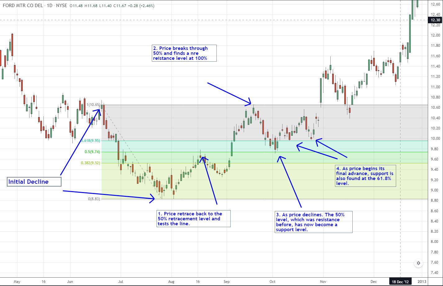
Fib Retracement by mpro source: TradingView.com
Fib. retracement lines are mostly used as a form of support and resistance. Price tends to bounce on fib. retracements quite a lot. But you should always use fibonacci retracements in combination with other confluences.
5.8. Everything combined
You have learned so many things, you probably already forgot what the most indicators do and represent. No need to worry, it will all make sense in a few minutes. The first thing you need to understand is that every indicator is just part of a trading system. The “holy grail” indicator does not exist. Read that last sentence again. There is no magical indicator that does everything for you. It simply does not exist.
Do you need to have in-depth knowledge about every indicator out there? No. If you know the basics that’s just fine. You might have noticed that I did not provide all the details. That’s simply because there are many, many websites out there that can explain every indicator in much more depth and detail. It can become quite complex. And if I would explain every detail of every indicator out there this guide would be thousands of pages long. The key part you should take from this is that every indicator works on an individual basis. The strength does not lie in the indicator itself but all indicators used together.
This is very important to understand. Any professional trader will use a combination of indicators, chart reading and other useful tools to create a profitable trading system. It’s like building a car. While every single part is crucial, the car only works when everything is put together.
The biggest mistake 95% of traders make is using too many and the wrong indicators. They think that putting five volume indicators on the chart is giving them useful information. While in reality, all these indicators are telling you the same thing. You should never use more than five or six indicators. Indicators are tools to help you identify certain patterns. Indicators should complement each other. Only if they complement each other should you use them. So best practice is to use only one indicator from each type:
- Use one volume indicator
- Use one trend indicator
- Use one volatility indicator
- Use one momentum indicator
You can combine these indicators with:
- Support and resistance lines
- Trend lines
- Candlestick patterns
- Wave patterns
- And others
So it does not matter if you use MACD or RSI. Just pick one that fits your strategy. If you are new to day trading, you probably don’t have a strategy and have no idea how to create one. That’s totally fine. Creating strategies is something for the long term. For now, you can simply copy any strategy you can find on the internet. That does not mean you pick a strategy and put all your savings in a few trades. We first need to backtest if the picked strategy even works. You will learn how to do this in the next chapters.
- There are four types of indicators:
- Trend indicators
- Momentum indicators
- Volatility indicators
- Volume indicators
- Only use one indicator from each type.
- Never use more than five indicators at the same time.
- Never trade based on only one indicator.
- The best indicator is a combination of all types of indicators.
- Indicators must complement each other.
- Use indicators in conjunction with wave patterns, support and resistance, trendlines and candlestick patterns (this list is not conclusive).
Good job! You gained 5 XP and 0 0 5 . What's next:
- Share my article with someone you think should learn this too:
- Let me know what you think in the comments.
- Want to learn more? Click on the next article below. You gain another 5 XP and 0 0 5 .
- Join the community if you want to keep your earnings and track your progress: Join the community
